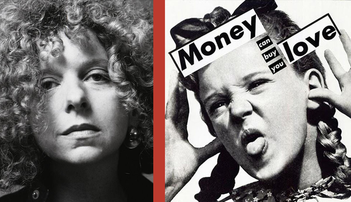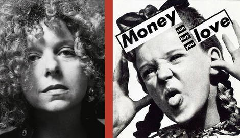
Legendary American text artist Barbara Kruger made her name in the 1970s with striking, attention-grabbing slogans in black, white and red. Adopting the aesthetics of advertising, she combined-short texts with photographs for immediate impact. Her terse statements question the everyday images and texts that surround us, inviting us to rethink their role in politics, power and control. But it is her Feminist imagery that has had the most lasting impact, remaining popular among campaigners and protest groups around the world.
A Troubled Neighbourhood

Barbara Kruger was born in 1945, the only child of a relatively poor family in Newark, New Jersey. Raised in a poverty-stricken neighborhood where racial tensions ran rife, Kruger remembers witnessing societal struggles with marginalization from a young age. She was bright and ambitious, with aspirations of becoming an architect. But after attending Weequahic High School, Kruger chose instead to study art at Syracuse University in New York.
Out of Place
At Syracuse University Kruger immediately felt out of place, remembering, “Most of the people there were very wealthy and had a lot of facial surgery.” When her father died a year later, she chose to return back to live with her mother in New Jersey. She arranged a transfer to study at Parsons School of Design in New York, and was taught by photographer Diane Arbus, in who she found a like-minded spirit. Graphic designer Marvin Israel also had a powerful influence on Kruger, encouraging her inclinations towards graphic design.
Work as a Designer

After leaving Parsons School of Design, Kruger found work as an entry-level graphic designer for the Conde Nast publication Mademoiselle; just a year later she was promoted to the role of head designer. Initially, she loved the work, recalling, “… it was all new, and I thought I wanted to be Art Director of the World!” But she soon became tired of the constant demands from clients and began searching for an outlet with greater expressive freedom. But she soon became tired of the constant demands from clients and instead moved into art practice.
Finding Art

Kruger’s early artworks were feminist in approach, including crocheted erotic objects and wall hangings made from feathers, yarns and sequins. But she remembers being dissatisfied because her practice didn’t reflect her growing political concerns. In 1976 Kruger relocated to Berkeley, finding teaching work at the University of California. While living there she found a peer group of like-minded artists including Ross Bleckner, David Salle, Cindy Sherman and Jenny Holzer. By the 1970s she had moved on to explore combinations of photography and text, including the self-published book Pictures/Readings, 1979.
Striking Statements

In 1979 Kruger abandoned photography, choosing instead to work with found images, which she would subvert by overlaying them with collaged texts. As influenced by her early work as a graphic designer, she began incorporating short, punchy statements. When placed with pre-existing imagery, Kruger realized she could open the image up in a new way, raising pertinent issues about oppression or violence, particularly in relation to rising Feminism and The Women’s Movement. Reducing her colours to red, white and black was influenced by Russian Constructivist artists such as Alexander Rodchenko, but it also gave her work the striking immediacy of tabloid headlines.
Feminism and Consumerism

Artworks with a Feminist slant include (Perfect, 1980) in which the torso of a woman is seen with hands clasped together like the Virgin Mary, a vision of submissive compliance, while the word “perfect” runs along the lower image. But her most famous artwork is (Your Body is a Battleground, 1989), which became the poster image for a series of much-publicized campaigns. She also explored the relationship between consumerism and desire by upturning the language of advertising, as seen in When I Hear the Word Culture I Take Out my Checkbook, 1985 and I Shop Therefore I Am, 1987.
Public Art

Since the 1990s Kruger has created full-scale, immersive installations, sometimes covering entire gallery spaces with words; she called her exhibition at Mary Boone Gallery, New York, 1991 an “arena of hostility.” Kruger has also made public art installations on walls, billboards and buildings around the world, as well as provocative magazine covers for magazines including The New Republic and Esquire. Along with her subversive practice, Kruger writes polemic articles for The New York Times and The Village Voice.
Auction Prices


Did you know?
Kruger never completed her art degree, after losing faith in traditional fine art. Before she began working as a designer, her first job was as a telephone operator.
Publications Kruger took on freelance design work for in her early career included House and Garden and Aperture.
A staunch feminist, Kruger’s text art often conveyed potent, powerful and politicized messages. Her artwork Your Body is a Battleground, 1989, was used as a poster for pro-choice campaigners in a 1989 Women’s March in Washington.
In response to Governor Spitzer’s prostitution scandal, Kruger made a magazine cover for Consumer Magazine, with a picture of Spitzer and the slogan “BRAIN” followed by an arrow pointing towards his crotch.
Kruger made the Futura font famous with her red and white slogans. As influenced by her, streetwear brand Supreme transposed the same style and colour font into its logo.
Kruger’s signature use of black, red and white with eye-catching slogans also had a profound impact on a graphic designer and street artist SHEPARD FAIREY.
During the New York-based performance art biennale Performa 17, 2017, Kruger staged a pop-up shop, where she sold a series of hoodies, t-shirts, patches, beanies, and skateboard decks featuring her trademark graphic slogans.
As a part of the same Performa 17 event, Kruger took over a skate park in Chinatown, produced a limited edition run of MetroCards and printed a series of slogans across a bus in New York.
Kruger designed a notorious cover feature for W Magazine in 2010 featuring a nude Kim Kardashian, whose body was only partially concealed by text, a move that prompted some critics to accuse her of attention-seeking.
She also famously created several magazine-covers for New York Magazine, openly criticizing Donald Trump. One featured Trump’s face covered by the word “LOSER” in 2016, while another mashed together Trump and Putin’s names into the words Prump and Tutin, alluding to their closely aligned politics.


