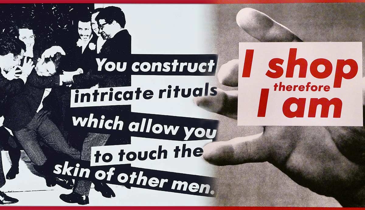
The sharp-witted posters of Barbara Kruger are familiar even to those who have never heard the artist’s name. The icon of conceptual art, Kruger relies on text as her primary expressive means. This feminist artist often overlaps text with stereotypical images, retro aesthetics, and advertisement slogans. Read on to learn more about Barbara Kruger’s feminist work, activism, ideas, and artistic methods.
Barbara Kruger: Appropriating the Language of Persuasion

Barbara Kruger, a New Jersey-born conceptual artist in her late seventies, is not a loud and social figure in the art world. Not much information is available about her personal life. She prefers to remain private and not let her identity interfere with her work and our perception of it. However, we know that before her artistic practice, Kruger worked as a graphic designer and picture editor for various media, including Mademoiselle and House and Garden. These women’s magazines focused on fashion, home design, and style tips, and they were filled with never-ending advertisements of sponsored products. While working for the magazines, Kruger got familiar with the visual and written language of persuasion. She got to experience the way power dynamics hid beneath the cheerful promises of an ideal picture-perfect lifestyle.
For the first years of her artistic career, Kruger incorporated feminine crafts into her artworks. She worked with embroidery and weaving, adding glitter and ribbons to her semi-abstract compositions before realizing the limit of these works’ power. For her, language held much more expressive potential, ambiguity, and space for interpretation.
A significant part of Kruger’s inspiration came from the works of Andy Warhol and his views on the capitalist landscape. Kruger often strips the words and images to their uncanny core, revealing the cogs of their mechanisms and the malicious intent of those who constructed them. Here are 6 of her works that you should know.
1. Bodily Autonomy: Your Body is a Battleground

Perhaps the most famous work of Barbara Kruger is the 1989 poster Untitled (Your body is a battleground), made for the Women’s March on Washington as a protest piece against anti-abortion legislation. Bodily autonomy and the forces attacking women’s agency in the context of their physical characteristics are a common domain for Kruger’s exploration. Over the years, she has addressed unrealistic beauty standards, endless conveyor belts of trends and demands, as well as the rules set by a limited few. Abortion rights are one of her long-lasting concerns. In 1989, the poster made a lasting impression on both sides of the protest and was later translated into various languages and used in pro-choice demonstrations around the world.

The peculiarity of the poster is that it does not immediately take a straightforward stance and does not call for action of any kind. Instead, it simply states the obvious fact and the essential source of conflict. Tragically, a quarter century later, it still has not lost its painful relevance. In 2022, after the US Supreme Court decided to overturn the country-wide right to abortion, Kruger made a new version of the poster. This time it was placed on the cover of the New York magazine.
2. Attacking the Class Barriers: Who is Healed? Who is Housed?

Barbara Kruger deliberately erases the boundaries between high and low art, as well as public and private spaces. She mixes popular and niche, the acceptable and the forbidden. She often includes her works in spaces such as public transportation—a place where class differences are seemingly toned down, yet in reality, the power dynamics are just as present and powerful here as anywhere else. In one of her many projects, Kruger designed the tickets for the New York Subway. To get rid of the exclusivity fleur, the tickets could be purchased only through regular ticket machines, mixed with normal non-decorated ones. Tickets featured socio-political questions asked by Kruger. These do not call for immediate action but raise the self-conscious questions of privilege and access to basic needs.
3. Consumerist Mania: Our Prices Are Insane

A significant cluster of Barbara Kruger’s work concerns the issues of overconsumption as a lifestyle and the ways capitalism forces populations to participate in it. Kruger’s collages highlight how consumerist mania flirts with actual madness, reproducing the never-ending cycle of desires and impulsive purchases. The cycle has to move fast so the victim would not have a spare second to stop and think about their impulses, needs, and fatigue from sensory overstimulation.
One of the famous collages on the matter is the blood-splattered face of a silent film madman, crossed with the promise of insanely low prices. Another is a red frame simply stating I’m just looking. The phrase is banal, common in every language, and carries the same deep connotations. It rarely means what it says. Rather, it signifies deliberate avoidance of human contact and a false sense of independent choice. These slogans dabble into faux exclusivity, as well as a false sense of belonging and understanding. The desires and needs are not even predicted but manufactured and planted by algorithms, making the customers uniform and unanimous in their perceived uniqueness.
4. Memory and Nostalgia: It’s a Small World

Most of the photographs used by Barbara Kruger in her work refer to the past era of the 1950s and 1960s. This choice is far from random. During those decades, the media gradually started to tighten its grip on its consumers, developing stereotypical images of a successful life, perfect careers, and immaculately clean houses run by perfect and not overly ambitious housewives. Gradually, the product offered to consumers mutated into something new. At some point, marketers stopped selling feelings or actions, instead, they switched to memories of feelings and actions gathered before the media established its dominance.
Kruger’s work provides no ready-made ways of escaping. She highlights the infantilism and passivity upon which the culture and power dynamics rest, yet hardly calls to direct opposition. Instead, she plants seeds of doubt and disgust. Kruger’s works are observations that inevitably provoke a response of rejection. The responsibility for actions and reactions is entirely in the spectator’s hands, thus allowing Kruger to avoid accusations of taking the moral high ground. Morality is another concern of Kruger—she resents this term for inherent exclusivity and hypocrisy, preferring the term ethics instead.
5. Gender Expression and Masculinity: Intricate Rituals

As a feminist artist, Kruger often comments upon gender dynamics and oppression, yet she does not limit herself to the images of women’s lives controlled and bent by patriarchy. She often addresses the absurdity or unwritten rules and the machismo complex ruining the lives of everyone involved. Despite the claims of the art world’s conservatives, Kruger is not anti-men but anti-machist. She highlights the infantilism of aggressive masculinity and the traumatizing lack of empathy behind it, which targets the same men who perform it.
6. Commercializing Art: Barbara Kruger VS Supreme

Most of Barbara Kruger’s artworks are simple collages featuring black-and-white photographs with overlaid text and a glossy red frame. Alone, a single work of Kruger fulfills her communicative purpose, but to understand her oeuvre, one has to look through at least several of her collages. By standardizing the formal qualities of each work, Kruger turns a seemingly simple practice into a methodical exploration of media, propaganda, and implanted values.
Kruger’s artistic practice is much more complex than it seems. From its essence, it actively opposes the act of labeling identities, formats, art forms, and ideologies. Kruger is entering the system in order to highlight its flaws from the inside. Yet, unlike many of her colleagues following the same path, she manages to stay away from the constraints of the market. Protest artists like Banksy often get devoured by the system that they initially tried to dismantle and become yet another element of it.
However, although Kruger herself managed to retain her independence, her art, at least partially, did not. In the early 1990s, the brand Supreme appropriated the graphic style of Kruger. There was no formal ground for a lawsuit since Kruger used more or less popular fonts and shapes. In the hands of Supreme, the aesthetic of Barbara Kruger’s art was further commercialized. It became the same thing the artist was arguing against, another element of the consumption cycle, forcing its audiences to mindlessly consume unethically produced useless products.


