Claes Oldenburg designed and built a whole environment filled with objects recognizable to every American. His pop art installation called The Store was not only a direct critique of the capitalist society treating art as a commodity, but it was also a logical step in the development of Western landscape art. Read on to learn more about this fascinating piece of American art.
What Was Claes Oldenburg’s The Store?

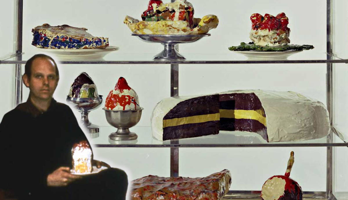
In 1961 the famous pop artist Claes Oldenburg opened a store in the Lower East Side of Manhattan. Or was it an art gallery? Or a workshop? It could be all of this in one. Inside the space on 107 East 2nd Street, garments hung on the walls, pies, and cakes were lined up in cases, and burgers and meat cuts were displayed with weirdly deformed coffee cups and smashed soda cans. At the center of it was a cash register. Although the shape of the register was recognizable, it looked more like someone took a Jackson Pollock painting, crumpled it, and molded it into this shape.
Neither pastries nor sandwiches were edible. Oldenburg made all these objects from the cheapest materials possible and painted them with just seven pure colors of canned paint. He never meant for the design of his space to be original or inspiring. It was a carbon copy of a random American store: not a boutique or a fancy grocery shop, but rather a small place with cheap goods of questionable quality, found in every neighborhood and probably run by a family of immigrants. Oldenburg created a real pastry case filled with simple and recognizable desserts like candied apples and ice cream sundaes, undergarments of all sorts soaked and shaped with plaster with price tags all ending with 99 cents, and cheap stationery and posters mixing the English language with Spanish.

Claes Oldenburg, the son of Swedish diplomats, grew up in Chicago and New York and took his inspiration from his daily surroundings rather than from metaphysical concepts. Oldenburg’s interest in replicating everyday objects was not a one-time thing. Over the following years, he designed more pieces for The Store and created a separate installation titled Mouse Museum, consisting of various elements of American daily life.
However, Oldenburg is best known for his gigantic sculptures of ice cream cones, hand-sewn giant burgers, and lipsticks on caterpillar tracks. By exaggerating the size of his objects, Oldenburg simultaneously forced his audience to look at them from a different perspective and changed the environment around them into an imaginary scene. The Store, in that sense, had several subtexts. One can be read as a reminder of children’s practice of playing shop with money and commodities often constructed from whatever objects were available. Another can be noticed through an uneasy feeling similar to the uncanny valley effect. All things on display were familiar and recognizable, yet their unnatural size and inedible texture interfered with the identification process, frustrating the viewer’s brain.
The Philosophy of Pop Art and Performative Consumption

Pop art, with its bright recognizable objects, logos, and the all-American aesthetic, was a direct response to the domination of Abstract Expressionism on the American art scene. By the 1960s, paint-splattered canvases and gesture painting had already bored the public. As it always happens with any trend, the pendulum swung in the opposite direction: art moved from complete abstraction to instant tangibility.
The commodification of art and the never-before-seen postwar production and consumption level inspired pop artists in numerous ways. By reproducing art as a commodity and replicating brand logos and packaging, pop art was simultaneously fueling the capitalist machine, elevating ecstatic consumption to the status of religion, and criticizing it with its own performative and exaggerated actions.

Still, the message was not unanimous among different pop artists. Andy Warhol, who famously said that buying is more American than thinking, actively engaged in performative consumption, making it appear genuine. Claes Oldenburg, on the contrary, preferred to take a step aside and openly criticized the capitalist society and commodification of art and emotion.
Another key feature of Oldenburg’s work, evident throughout his long career, was a genuine interest in objects as they were. By reconstructing a convenience store, enlarging burgers, or placing a huge cherry on an enormous spoon in a Minneapolis garden, Oldenburg urged his audience to appreciate objects through a magnifying glass. The artist himself stated that the only rule of his work was that it should not have any function, being a pure form.
The Construction of a Natural Landscape

Essentially, all landscapes are artificial and man-made rather than inherently natural. Classical landscape painting emerged in seventeenth-century Europe and developed from a subjective understanding of an ideal natural scenery. The landscape painters created imaginary scenes, often with references to Greek and Roman antiquity, carefully aligning elements like trees and rocks to achieve the perfect harmony of composition. Even after the paradigm started shifting towards more realistic depictions of nature, like in the case of Barbizon school painters, it was seldom a true natural scene. Almost every landscape painting contained traces of human activity seen through dirt roads, windmills, plow fields, or boats at sea. All of these were not merely decorative elements but markers of human activity, time and place, era, and culture.
Industrialization changed all art forms drastically, not leaving landscape painting behind. With masses of workers leaving rural areas for the growing cities with more jobs and opportunities, their daily surroundings transformed. The working environment shifted from pastures, fields, and mills to factories, offices, and city streets. Though the traditional type of landscape with country scenes, seashores, and forests was not gone, the burden of representing the human presence in the current moment fell on the shoulders of innovative young artists focused on urban life.

The Impressionist landscape was rooted in changes in everyday life marked by the discoveries and inventions of the 19th century. One of the most important aspects was a relatively small invention that barely affected a wider audience but changed the way artists worked and thought. The invention of paint in portable tubes made painting outside possible, eliminating the timespan between witnessing a scene and recreating it in a studio. Because of this novelty, a landscape could now be an immediate reflection of reality, trampled only by photography in terms of producing a quick result. Modern buildings, streetlights, railroads, and fashion were all markers of the present moment.
As different as they seemed from the Impressionists, pop artists essentially applied similar principles. By constructing compositions out of newspaper clips, comics, well-known ads, logos, and packaging, they did not strive to create something new. Their main objective was to recreate an existing landscape, in a literal sense, as a physical environment surrounding their generation. By creating The Store, Claes Oldenburg built a landscape familiar to every American of his time and placed it in a sterile and exclusive environment. For Oldenburg, gallerists treated art like convenience store customers treated their pastries and stockings.
Claes Oldenburg’s The Store vs. Meow Wolf’s Omega Mart

While thinking about Claes Oldenburg’s replica of a convenience store, many art lovers can remember similar projects by other artists. The most recent one was presented to the public in 2021 in Las Vegas. Omega Mart by Meow Wolf is an enormous simulation of a fantasy supermarket filled with light and sound, secret walk-in spots, and weird products like bottled bog water or 5G lip balm that you can immediately buy. Conceptually, it might look similar to Oldenburg’s work, varying only in size, budget, and interactivity. However, while The Store was a clear and ironic anti-capitalist manifesto written in the capitalist language, Omega Mart is essentially a tourist attraction, which equals consumption to entertainment.
Moreover, its consumerist aspect is not limited by the necessity of physical presence. Most of the objects you can find on Omega Mart shelves are for sale. If you cannot make it to Las Vegas, you can always order a piece of experience online. Omega Mart builds its narrative on a blend of capitalist utopia and magical realism, combining a familiar setting and unimaginable consumer goods. Both installations are essentially capitalist landscapes, but The Store leaves room for a social commentary. At the same time, Omega Mart blocks any possibility of reflecting on it through endless sensory stimulation and built-in commercial features. Where Oldenburg saw a problem with turning creativity into a commodity, Meow Wolf projects enthusiastically encouraged it, further commodifying the experience and making it accessible to a small world of art collectors, critics, and the general public.


