Frida Kahlo understood that self-portraiture could be a tool used for expressing themes of a highly personal nature. She had a masterful understanding of the stories that could be revealed through a portrait. Even the most tragic of life events became a treasure trove of content for her paintings. Looking at her approach to composition, we are not exploring what she said in her paintings. Instead, we’re looking at how she said it. She used composition techniques to create incredible images that feed our curiosity.
1. Portrait of Cristina, My Sister by Frida Kahlo

Frida Kahlo was skilled at telling her own story, but this image tells us little about Cristina. The colors are soft and portray a tenderness. That pink in the lower part of the sky is particularly warm. It’s subtle because it’s in the lower part of the image, and the viewer is drawn to the focal point, which is the face, so it becomes something in the viewer’s peripheral vision. It definitely alters the feel of the image. If it were removed, she would seem cold. It also balances the pinks that are in her face. Overall, the colors are cool, but the warm colors are placed in more important positions, giving them equal strength. The warmest part of the canvas is the face, which is the focal point.

The diagram shows the leading lines in the image. The viewer is guided to look at the face. The shape of the tree and the branches all point towards her. The leaves are a similar shape to Christina’s lips. This means that every leaf links the viewer to those lips. They share a common shape and are painted in complementary colors—red and green. There is also a leading line to the eyes—a small leaf at the top points in that direction. The eyes and the lips are the focal point, as indicated by the triangle in the diagram. More detail and subject matter are on the right side of the canvas. Kahlo used the darkest point in the image to balance the detail on the right. In the painting, Christina’s black hair creates that balance.
2. Self-portrait on the Borderline Between Mexico and the United States

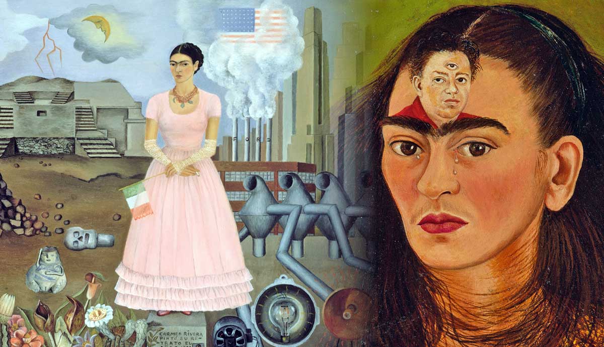
This work is in contrast to Kahlo’s painting of Cristina. Kahlo incorporated symbolism, so the work is full of interesting details. The viewer has so much to explore, but Kahlo remains the focal point. She constantly portrayed herself as the center of her own story. This work shows her on the border between Mexico and the United States. However, in this composition, she painted herself as the border itself. To the figure’s left is a depiction of Mexico, and to the right is the United States. Her figure divides the canvas in two. Complex detail needs to be balanced with some areas of simplicity, so the initial structure of the composition is simplistic and highly effective.

The diagram shows green circles that balance each other. Three circular objects are in the bottom right. This is balanced by one circle and a partial circle in the top left. Those two areas of the canvas balance each other. There are also circles in a line next to the figure. They add necessary contrast to the large number of vertical lines in that part of the work. The painting has more large circles on the right, but it’s balanced by the area shown in yellow on the diagram. It’s a pile of small rocks, and they’re not completely circular, but they have enough in common to balance the circles on the right. Kahlo could balance many different elements, making her images complex and intriguing.
3. Self-Portrait Dedicated to Leon Trotsky

If we look at the color brown, we can see that its positioning is an inverted T shape. It has a basic structure to its positioning. It can be helpful to think of each element as having its own structure. You can keep those structures basic because they become more complex when layered with other structures. Let’s look at how pink is positioned. We can see that it’s mainly those visible pink areas on the dress. Still, the pink flower in her hair is significant. It gives a triangular shape to how the color is positioned. A triangle with a wide base at the bottom as if it’s pointing up. The part of the red top that is shown is the shape of another triangle that is pointing down.

When you look at color positioning, the image is constructed by layering composition structures that are mainly basic shapes. Triangles, a T shape, and if you look at the positioning of the white, it’s in a U shape around the central focal point of the letter in her hand. If you look at the green, it’s almost an inverted V shape that balances with the shape of the white. There is complexity in how the color is positioned. Still, the composition seems simplistic due to the line and form. In the diagram above, the green lines highlight that the basic structure is triangular. This shape is then framed by the other shapes made by the curtains.
4. Diego and Frida

This painting illustrates how direct Frida Kahlo could be about her emotions. It’s an example of how Kahlo understood the flexibility of self-portraiture. One glance and viewers are captivated by her story. It’s a brilliant ability for an artist to have. However, when analyzing the composition, you’ve got to see beyond the drama of Frida Kahlo’s love life. Her paintings hang like a piece of gossip waiting to be circulated. The viewer must hold firm and look at color, form, and structure. Kahlo wasn’t just drama and intrigue. She was the creator of masterpieces, and she used immense technical skill to create them.

When an artist really understands composition, they recognize that everything on the canvas is an element that needs to be balanced. In the diagram, the positioning of the writing is shown in yellow. Yellow is also used to highlight the positioning of the red color on the dress at the bottom of the image. These are all elements that balance together.
The writing includes punctuation, but Kahlo added two prominent dots to the image diagonally on the canvas to give them a more interesting and dynamic composition. It shows that Kahlo was an artist who never stopped thinking about composition, even when it came to details as small as a dot. The central part of the image has a clear structure—repeated triangles are overlapping. The focal point of the image features the two faces and the composition is also improved by them looking in different directions.
5. Sun and Life

Sun and Life appears to be a painting that moves away from portraiture. However, there is an image of a fetus in one of the seed pods. Earlier in her life, Kahlo had a miscarriage, so there could still be links with portraiture. This work has a similar composition to Self-portrait on the Borderline between Mexico and the United States because the focal point was placed vertically and to the right of the center. It’s a classic composition with links with the rule of thirds. The blue in the bottom half of the image pulls the viewer’s gaze to that section. Then, the pods create these wonderful soft vertical lines that guide you to the upper part of the image.

The green line on the diagram shows the focal point in the work. The third eye creates a triangular structure, and combining basic shapes can strengthen a composition. The seed pods aren’t uniform, and this creates more flexibility. The purple lines in the diagram show how they are structured to curve around the sun. The sun is a series of circles that become less defined as they get bigger. Those purple lines could be seen as an outer circle, one that has the highest level of distortion. In the diagram, two similar shapes are colored yellow—these are positioned diagonally like the dots in Diego y yo. Triangles, circles, curved vertical lines—this image has everything unified in an aesthetically pleasing way.
6. Still Life with Parrot and Flag by Frida Kahlo

Frida Kahlo didn’t only understand the versatility of portraiture. The placement of a Mexican flag shows that she could also tell her story through still life. There is a soft, naturalistic use of color. Flags contain bold colors that sometimes aggressively dominate a work, but Kahlo considered this. Above the Mexican flag is a green parrot next to red fruit. It extends the color into the surrounding subject matter and removes some intensity. Below the Mexican flag, the red color extends horizontally to the left of the canvas, where a small green fruit is placed.

It’s an image dominated by circles and partial circles. In the diagram, the blue circles show the circles in the foreground. The other fruit is positioned in rows, as indicated by the gray lines in the diagram. The banana is placed at an angle so it’s parallel to the back of the parrot. The positioning highlights the shapes that they share in common.
The banana points the viewers to the left. They follow the line of circles and detail and when they reach the left, they are encouraged to gaze diagonally because they follow the only complete circles on the canvas. The shape unites the three locations. The viewers could look at the other fruit, however, these all curve to the parrot. From the parrot, they follow the Mexican flag and the line of its stem, or they notice the banana that points to the left. The image has a composition structure with a high amount of movement which makes this painting a masterclass in composition.


