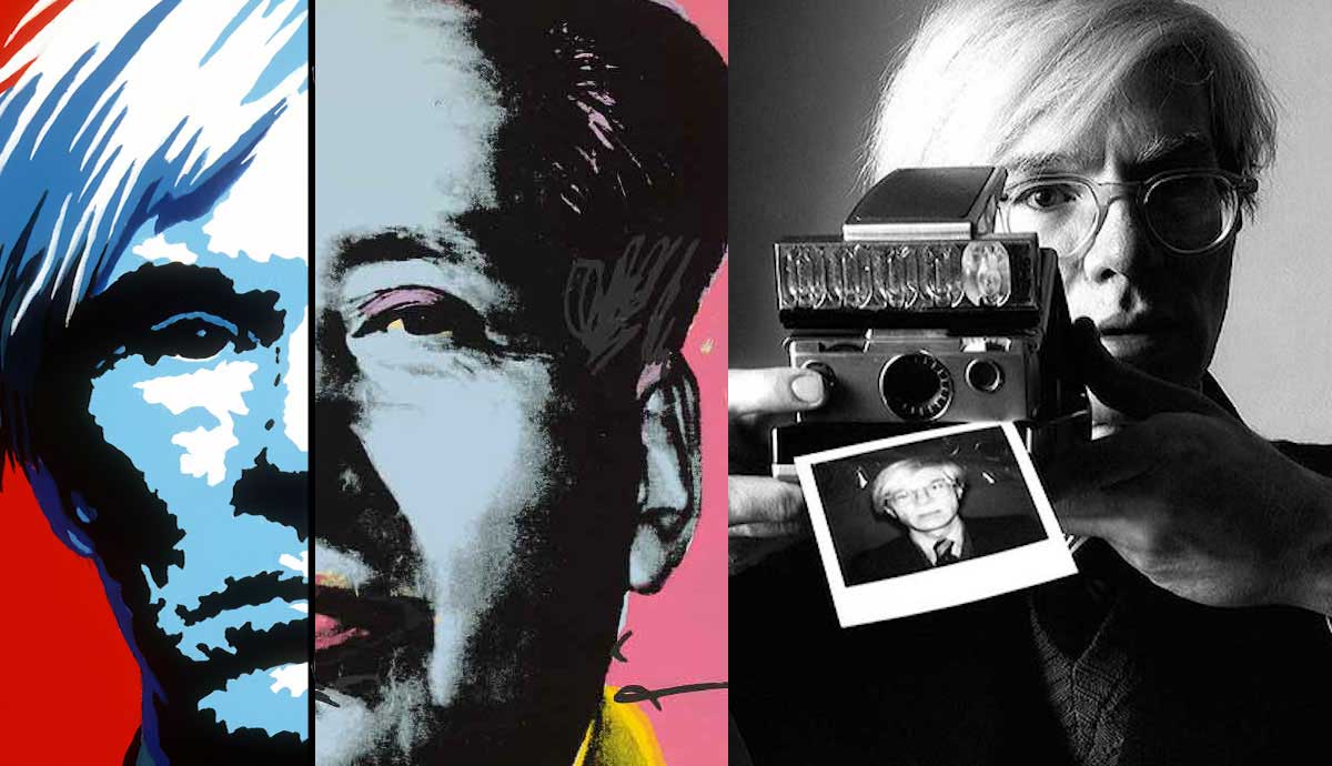
Andy Warhol was known for being both a celebrity and an artist. He was often spotted at exclusive parties where he made friends with the A-listers. Although he made visually appealing artworks, many people still wonder what it was that made him so famous. While many are huge fans of Warhol’s works, there are still those who think his art lacks substance and does not require any real talent. In reality, Andy Warhol’s work was refreshing, it showed new artistic techniques and carried a deeper message that many tend to overlook. Let’s take a look at how you can better understand the works created by the famous pop artist.
The Refreshing Work of Andy Warhol

The art world and the regular everyday world are two very different things. In the art world, there are works exhibited in museums because of their historical significance or the unique messages that they carry. When regular visitors come to a museum, they often gaze in awe at these pieces of history, but they wouldn’t exactly want these works hanging in their homes. Think of artworks like The Fountain by Marcel Duchamp or The Sphinx by Georg von Rosen. These pieces are highly regarded and loved due to their historical and cultural impact. Perhaps, a prolific art curator would want to take these pieces home, but a regular person probably wouldn’t want a signed urinal sitting in their living room or a strange, woman-cat figure staring into their eyes while they try to sleep at night.
Andy Warhol’s work took a refreshing tone due to his knowledge of what was desired by the everyday people of his time. Due to his career background, the pop artist knew both the commercial world and the artistic world. As a commercial illustrator, he knew what people wanted to buy, take home and hang in their apartments. So, Warhol made art that would appeal to the people.
Understanding Warhol’s Talent

Warhol combined his work experience with his artistic side. In his early career, he often made looser, story-like drawings or blotted-line drawings, where he used ink to loosely trace over already drawn lines. This type of stylistic choice carried over onto his prints in his later career when he invited the natural occurrence of errors in. This can be noticed through ink blots, blurred lines, and purposeful mark-making.
Furthermore, Warhol proved to have an understanding of the principles of design. His use of stark, complementary color palettes was eye-catching, forcing the viewer to gaze for long periods of time. His knowledge of composition made for thought-provoking creations. Warhol understood the interplay between positive and negative space and used it to his advantage, pleasing the experts of the art world. The refreshing nature of Warhol’s artwork included his ability to walk the line between the commercial sphere and the art world. Some may see his pieces as boring and predictable, but others see masterpieces that are both socially desired and artistically revered. Not only was Warhol able to appeal to the masses through his creations, but he was also able to appeal to the critics.
Understanding Warhol’s Repetition

Many believe that Warhol lacked talent, but his works beg to differ. Let’s take a look at his famous portrayal of Campbell’s Soup. The image above may appear to be a photo of a soup can, copied and pasted 32 times, however each image was hand-painted by Warhol. He used 32 canvases to represent the 32 flavors of soup that Campbell’s offered at the time, displaying them in a style inspired by the look of a grocery aisle. Despite their differences, the paintings seem identical. One can only imagine the amount of time and focus, coupled with artistic proficiency that was required to make these artworks.
Not only is it accurate and uniform from a formal perspective, but Warhol was also able to work within the constructs of Campbell’s font, emulating the wording with surprising detail every time. With only slight variations in color, it is hard to believe that each of these was actually painted. Because of his technical decision, Warhol was able to avoid plagiarizing the image of Campbell’s cans and appropriated it instead. Painting the image himself, natural differences between the images would occur. Even so, plagiarism most likely would not have been an issue anyway, since Warhol was promoting the company by using their product.
Understanding Warhol’s Expressive Screen Printing

Although Warhol had a talent for painting, he is best known for his proficiency in silk-screen. Printmaking was not a new technique during Warhol’s time, but his methods and ideas were unique. In addition to his odd, yet striking color choices, Warhol added an expressive quality to his prints that combined his commercial background with his expressive pursuits. Warhol also welcomed the prevalence of human error during mechanized processes. His expressive marks and noticeable imperfections became a part of what makes his work unique and special. Warhol’s obsession with repetition was still apparent through his print-making skills, but the variation between each print became more important than the production of the images.
Understanding Commercialism

Often when people see a piece created by Warhol, they wonder why they are looking at a printed picture of a can of soup hanging on a wall in a museum. It could seem useless to them. What is the meaning behind the work showing this random household item? Although it may sometimes seem almost comical, Warhol’s work carries a lot of meaning. Warhol believed that art should be for everyone, not just for the elite. This went against the ideas of the luxurious nature of fine art, exclusive to those that could afford to buy it.
Warhol also made a consistent commentary on commercialism. Commercialism refers to society’s method of mass-producing items and selling them in large quantities, lessening their value. His work reflected the idea that society had lost the uniqueness carried in individually made items. Therefore, his art showed a world solely focused on making money and not on producing products of quality. Warhol’s prints mimic these ideas making us question the original image versus the reproduction. Because of this, Warhol’s repetitive images walk the line between the graphic prints he created for sale and the fine art in which he showed his inner criticism of American culture.
Understanding Andy Warhol’s Obsession with Pop Culture

Not only was Andy Warhol creating satirical artworks that mocked the exclusiveness of fine art, but he also used his printmaking skills to comment on America’s obsession with numerous icons of pop culture. The Marilyn Diptych is one of Warhol’s best-known artworks to date with a myriad of the underlying context. Warhol’s obsession with Monroe began after the famous actress died. Warhol used repetition to remove Marilyn’s personality, turning her into another commodity made for sale. In a way, he stripped Monroe of her personhood by simply repeating a picture of her that slowly lost ink. Warhol made Monroe into a flattened image with no dimension, she became a face for the camera. The use of color contrast also added an interesting tone to the artwork.
On one side of the diptych, Warhol employed his usual contrasting and unnatural coloring. On the other side, he almost progressed Marilyn into death through the black-and-white transition of the images, welcoming mechanical mistakes that created black areas. For some, this looks like a repeated image, for others, Warhol’s Marilyn carries a lot of weight by referring to how American society saw and used Marilyn while disregarding her as an actual human being. Warhol may have walked on the slippery slope between plagiarism and unoriginality, but his context was completely unique and important.


