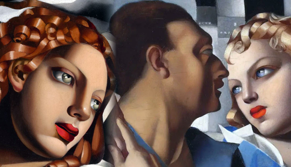
Tamara de Lempicka’s artwork was designed to be striking. As a viewer, you can become lost in the final result and lose sight of how she constructed her images. These beautiful Art Deco paintings speak of glamor and style and reveal a masterful approach to composition. Tamara skillfully combined structure, color, and shape in compositions that have enticed viewers for years.
Tamara de Lempicka’s Self-Portrait in Green Bugatti

When you look at Self-Portrait in Green Bugatti, the first thing your eyes focus on is the face. It is the section of the canvas that is the lightest. Tamara de Lempicka used variations in light to guide the viewer’s eyes to that canvas area. Still, it is not the only method she used. She also relied on multiple strategies to ensure your focus went to the woman’s face. The artist used the car as an object of style and luxury. Then, she made a composition encouraging the viewer to look at her first.

In the diagram above, the simplified image is there so we can analyze the work more easily. Notice the red circle. It is a color that occurs once. It’s localized, and that makes it more noticeable. We focus on the lips. They are a bright red, surrounded by more muted tones. The viewer is drawn to the difference. We look at that area because it doesn’t conform to the rest of the canvas. It contains something new. In choosing her lips as the focus, the artist gave the woman a level of feminine seduction. Yet, she can also convey herself as cool and aloof.
The diagram also highlights the structure of the work. The parallel lines lead the viewer’s gaze. They all suggest looking to the upper right, towards the face. The structure of the piece has a V shape. With portrait format images, the composition is often stronger when the upper part of the image contains more detail than the lower part of the image. The V structure works with that concept in mind. For example, notice the glove. It shares the same color as the face, and it continues the V structure into the upper part of the canvas.
Using Basic Shapes to Frame the Face

Tamara de Lempicka could make the viewer focus on the face. In figurative art, the face isn’t always the focal point. However, Lempicka wasn’t just a figurative painter. She made portraits, and the face became more important when depicting someone’s identity. She used the same bright red on the lips, but the color has less impact because the contrast is smaller.
In Self-Portrait in Green Bugatti, the rest of the canvas was cool in color, making the contrast more extreme. In this image, the warm brown hair is in harmony with the lips. It is the green grapes in her hair that provide the contrast. Red and green are complementary colors. Red is a primary color, and green combines the other two primary colors. The difference between them creates a pleasing aesthetic.

In the diagram above, I’ve simplified the image structure. You can see a half-circle on both sides of the face when the image is reduced to basic shapes. When creating a good composition, it works well when a shape is repeated in a slightly different way. The shape on the upper left is made from the positioning of the grapes. The shape on the lower right is made from the hair. Those shapes frame the face. It is a circle framed by two half circles. It’s a simple structure, but Tamara de Lempicka ensures it isn’t immediately noticeable to the viewer. That simple structure is hidden behind a visual contrast, the difference between curled hair and circular grapes. The detail disguises a simple composition framework.
Portrait de Marjorie Ferry

This is a portrait of Marjorie Ferry. The relationship between artist and model will always influence a work. However, the relationship isn’t the main focus of a composition analysis. We have already seen how Tamara de Lempicka used red to create contrast. In this image, she used the same technique. Bright red lipstick and red nails contrast with the black and gray surroundings. In this image, Marjorie Ferry is holding material around her body. Tamara de Lempicka chose a pose that places the color red in three separate locations. Low, middle, and high zone of the canvas. This ties the color to the structure of the image, which is filled with heavy vertical lines.

Tamara de Lempicka balanced those heavy vertical lines. The bottom of the pillar contains short horizontal lines to contrast the verticals. The image would be too angular if not for her use of curves that hold the composition together. The material curves around the woman’s lower back. However, that curve is subtle because there is so much detail. It is easy to be distracted by the technical skill and beauty that can be found in how the material is painted. The bold curve unites the image. We see this curve at the bottom of the painting on the surface that Marjorie Ferry casually touches.
Portrait du Marquis d’Afflito

Tamara de Lempicka’s composition techniques were not developed in a vacuum. She was exposed to the art of other artists, of course. In this image, she referenced Édouard Manet’s famous painting Luncheon on the Grass. The figure here is given a similar pose to one of the figures in Manet’s painting. His legs form the shape of a triangle. This is a shape that works well as part of the structure of a composition. It can immediately make a composition more interesting. Tamara de Lempicka learned various composition techniques through studying the art of other artists. Still, she did not simply copy what somebody else had done. She took ideas from multiple places, and then she skillfully combined them.

Take a look at the diagram above. The added color shows how aspects of the composition relate to one another. The orange shape that represents the legs points upward. Those shapes are balanced by the green shapes on the right, which point downward. These shapes are created through the shape of a tree in the background and a dark shadow between two rocks. The basic shapes in the structure encourage you to gaze in a circular motion around the canvas, up at the left and down at the right. The horizontal position of the body then links both sides of the canvas. The shape of the torso is also repeated in the shape of a leaf. In the diagram, these are the blue shapes. Repeating a basic shape can give a composition more structure and complexity.
Idyll and Its Circular Structure

At first glance, a painting can appear to have a simplistic composition. Then, when you do a deeper analysis, you can identify the complexities that make something a masterpiece. An excellent composition can be appreciated on many levels. It can be enjoyed through a casual glance or through a full investigation. At first glance, Idyll looks simplistic. It has so much in common with many paintings and photographs of couples. It seems like a tried and tested composition you’ve seen many times before.

In the diagram above, you can see the image simplified. The triangle at the top of the image is created by a group of ships that get smaller as they move to the left of the picture. This creates a triangular structure that moves your eyes to the left. Then, your eyes are encouraged to look down because of the triangular shape of the man’s clothing. The hands slightly obscure the structure of his outfit, but that’s because the flesh color on the canvas is positioned in a circle.
All the warm colors are in a circle, and everything else is cool. This is an example of Tamara de Lempicka’s magnificent use of color. A triangular shape on the right encourages you to look up and towards the center of the canvas. The circular structure breaks slightly for the oval of the woman’s face. The image has two focal points, the woman’s face and the circular shape of their visible skin and your eyes move between looking at the large circle and the small circle.
Tamara de Lempicka’s Daughter Kizette

Fillette en Rose by Tamara de Lempicka is a painting of her daughter, Kizette. In many other paintings, there is an erotic sensuality that is not present in this image. There is no red lipstick to move your focus to the face here. There is no red in this image, but at the top, she used square shapes that get smaller as they go from right to left, the same as in Idyll.

In the diagram above, you will notice the simplified composition structure. See the triangular structure that dominates the composition. In this painting of Kizette, the artist remained true to her style but did not include some of the things seen in her most famous paintings. Kizette was portrayed with an awkwardness that’s suitable for someone so young, and Tamara de Lempicka proved that she was a master of composition.


