Painting objects and people realistically did not interest Henri Matisse at all. Instead, he was trying to depict the feelings his subjects aroused. The famous French artist relied on his instincts when choosing pigments. This approach resulted in highly unconventional paintings, which outraged many other artists and art critics. Here are some of Matisse’s colorful works that you should know.
1. View of Collioure (1905) by Henri Matisse

View of Collioure, signed by Matisse in 1905, features the painter’s favorite place in France. In Collioure, Matisse discovered light and colors and allowed himself to paint as freely as he wanted. This painting is also one of the most colorful in his collection of works. It was made using the Divisionist technique. One can clearly notice the colors applied in wide brush strokes standing next to each other. This vividly colored painting is an ode to the blinding sunshine of the south of France. Matisse managed to transpose sunlight on canvas by using pink, lilac, orange, blue, green, and red. To further enhance the hotness of the day on canvas, Matisse created a visible contrast between the reds and the blues and left some unpainted patches to further brighten the image.
2. Woman with a Hat (1905)

One of Matisse’s most famous paintings, Woman with a Hat, shows an explosion of color. It features Amélie Matisse, the painter’s wife as the main subject. The painting was exhibited at the 1905 Salon D’Automne where artists, art enthusiasts, and critics became outraged by Matisse’s bold use of vivid colors and loose brushstrokes. The work marked a shift from Divisionism to Fauvism.
There is no trace of traditional shadow here. Instead, Amelie’s face is covered in greenish, yellowish, and grayish hues that do not correspond with reality. Her nose is outlined by a green streak marked by a yellow tip, her upper lip is tomato red, while the lower lip is peachy pink. The giant hat that looks almost otherworldly when compared to the size of Amelie’s face is covered in orange, blue, and green. When asked what his wife was wearing while posing for the painting, Matisse replied: “Well, black, of course.” The answer is proof that Matisse’s art was more about the feelings a landscape, object, or person arouses than a genuine copy of reality.
3. The Open Window (1905)

The Open Window (1905) is one of Matisse’s earliest works highlighting his unconventional use of colors. The painting was also exhibited at the Salon d’Automne in 1905, where it stirred shocking reactions. André Derain, another Fauvist artist, spent a lot of time with Matisse discussing and developing the Fauve-typical techniques. He later commented that Collioure was so colorful that even the shadows were clear and luminous. So Matisse painted his impressions of this town by offering them colors of maximum intensity. He used blue, green, fuschia, red, and pink applied in brushstrokes that create the illusion of volume and depth.
4. The Green Stripe (1905)

The Green Stripe is another portrait of Henri Matisse’s wife, Amelie. There are no traditional effects of light and shadow in this work. Instead, the painter used planes of colors to outline depth and space. The most distinguishable plane is offered by the bright green line that divides Amelie’s face in half—one side shows rather pale, natural colors, while the other seems green or yellow. When the painting was first exhibited, the viewers and critics were appalled, stating that Amélie was depicted terribly. Over the years, however, people started to understand what stood behind Matisse’s explorations with color.
5. The Dessert: Harmony in Red (1908)

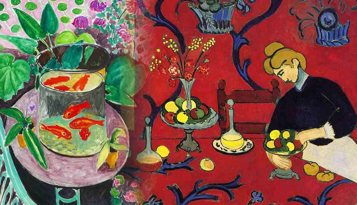
The Dessert: Harmony in Red is covered in arabesques and floral patterns finding their place in a dining room alongside multiple other objects. Matisse was born in Bohain, an important center for the textile industry, so he often used motifs taken from the textile industry in his works. There’s no focal point in this work and you might not know what exactly you should be looking at. The red color flows from the tabletop directly onto the wall without highlighting any change of space.
The Dessert: Harmony in Red was not as red at first. When Sergey Shchukin, the Russian art collector who supported Matisse’s art for a long time, commissioned it, the painting was to be named Harmony in Blue. Therefore, the first version of it was blue and not red. However, since Matisse was somewhat obsessed with red during this time of his life, he quickly realized he had to repaint his Harmony in Blue and Shchukin did not seem to have a problem with this. Matisse did not leave out the blue completely. He used it for the decorative elements on the surface of the table and the wall.
6. The Red Studio (1911)

Matisse continued experimenting with red in his work titled The Red Studio, focusing on a vibrant, rusty shade. He transformed the traditional interior still life into something that had never been seen before. He also used thin yellow lines to create the contours of the furniture.
Although there seems to be no central piece that immediately draws our attention, the clock shown in the back of the room does offer the painting balance and harmony. The other objects are scattered around the space as if they were floating in Matisse’s never-ending red. Needless to say, Matisse’s bold decision to focus on one color only when creating a composition was unspoken of. It marked a turning point in both his career and the evolution of modern art.

A study focusing on Matisse’s The Red Studio confirms that the artist used multiple pigments for it. He used lead white and zinc white, bone black, madder lake, carmine lake, vermilion, orpiment, viridian green, cobalt blue, ultramarine blue, cobalt violet, and eosin red lake. The study also showed that his favorite pigments were viridian, cobalt, and violet. This research also proved that, like The Dessert: Harmony in Blue, The Red Studio was not painted in Venetian red at first.
7. Goldfish (1912)

After his trip to Morocco, Matisse started using goldfish as a frequent motif in his still lifes, drawings, and prints. It has been said that goldfish serve as a metaphor for the artist’s most contemplative and tranquil artistic period. His Goldfish painting from 1912 focuses on the bright orange goldfish swimming in a cylindrical tank. The composition also features bright green shades and more subtle pinks. The most intriguing element of the work is the fish tank itself and how Matisse chose to depict the space within it. When viewed from the front, you can see the fish swimming in the water. From above, you will notice the reflection of the fish on the water’s surface.
8. Large Reclining Nude (1935) by Henri Matisse

Large Reclining Nude depicts Matisse’s model and assistant, Lydia Delectorsakaya, on what seems to be a bright blue-and-white couch. Matisse may have used these vivid colors to make sure that the nude became the focus of the painting. Above the model’s stomach, there are round shapes (possibly a flower vase) painted in bright colors. The red section behind the sofa can be interpreted as the floor, while the green-and-white part indicates the wall of the room. The nude in itself is highly disproportionate—the legs, hands, and torso are too large for the model’s head. At the start of his career, Matisse’s nudes were somewhat proportionate. Take The Blue Nude: Souvenir of Biskra, for example, which shows a very muscular, unconventional, yet proportionate nude. In Large Reclining Nude, on the other hand, the female body appears rather flat, with an almost unnoticeable facial expression.


