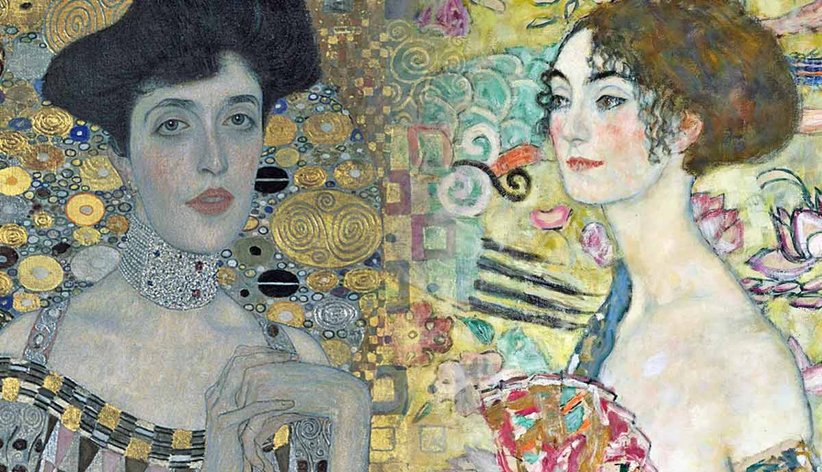
The familiarity of Klimt’s artwork makes it an inescapable part of a shared culture. His popularity is a recognition of his genius. His paintings have a universal appeal, and people who claim to know nothing about art can still recognize Klimt’s work and declare affection for it. It can be appreciated without a conceptual understanding. How does an artist create a piece of artwork that connects to so many people? How did he achieve that level of popularity? The answer is found in the technical skills Klimt had.
Gustav Klimt’s Lady with a Fan

Painted towards the end of his life, this image of a lady with a fan is a significant figurative piece. There is a complex use of color. However, the work isn’t bright or overwhelming. Klimt had a skilled understanding of how to balance color, which involved understanding light and shade. A colorful image doesn’t need to be intense. This image shows that a colorful painting can be soft and gentle. Yellow can be a difficult color to work with. When placed next to flesh tones, it can sometimes make people with a light complexion appear sickly. Mixing cream in with yellow makes it more compatible. Klimt used color variations. From a distance, you look at the painting and see one color, but when you look at the details, you see many. They merge together when the work is viewed from a broad perspective.

The diagram above shows how Klimt repeated shapes within this composition. A curved line is shown in orange and it is repeated in separate places on the canvas. The line of the woman’s back is parallel to the shape of the fan. It’s then repeated in the shape of birds. It’s a repetition of a prominent shape in the image’s structure.
That technique unifies the composition because it connects the areas of the canvas that share the same shape. The diagram also shows an S shape that repeats in various places on the canvas. Repetition makes the composition stronger, but it isn’t immediately noticeable. The details hide the structure so a viewer can appreciate the overall result without knowing how it’s been constructed.
Litzlberg am Attersee by Gustav Klimt

This piece captures Klimt’s approach to brushwork. Those sweeping areas of trees contain blue and varying shades of green. Many artists find creating that kind of brushwork meditative because it’s a slow and repetitive process. Others find it frustrating. In this painting, you can tell it was a process Klimt enjoyed because he dedicated much of the canvas to that brushwork. If you look at the mark-making and pick out a single shade of green, you can see that it is distributed evenly across that area. It is a pattern produced by human hands, meaning it doesn’t have a sequence but it isn’t random. Klimt distributed the shades of green as a pattern, a skilled composition technique. Whether it’s the position of brushstrokes or the shapes on a gold dress, Klimt was brilliant at positioning color and shapes.

This diagram reduces the image to its basic structure. That light blue is mainly on the top right, but the houses also have a similar color. They are in the image’s lower part, giving the canvas a diagonal composition because those colors link together. Although blue is also in the mark-making of those trees, the color is more prominent in some areas than others, so its positioning is more subtle than it might seem.
The diagonal structure can be seen more clearly in the color white. It’s placed in the top right and bottom left. The purple lines show their positioning relative to each other. Notice the rooftop of the house, shown as a dark blue triangle. It is parallel to that positioning, highlighting the composition’s hidden structure.
Birch Forest

Birch Forest is another artwork that contains those superb, patterned brushstrokes. The leaves on the ground are created from various colors, but when you look at the painting from a distance, you see a block of orange leaves. The leaves on the ground have a uniformity across the canvas. Klimt was repeating the same action across a large part of the canvas. The orange of the leaves is intensified by a small collection of blue flowers in the lower right of the image. Blue is the complementary color to orange, so they work well together. There is such a small amount of blue, so its purpose is to highlight the orange. The leaves are the focal point of the work. Had Klimt added more blue, it would have balanced the orange, and then the orange would cease to be the focal point.

The black line on the diagram shows a diagonal aspect to the composition. The bases of the trees are positioned diagonally from the lower left to the upper right. The main trees that form the structure of the composition are depicted in purple and orange. The other trees are detail rather than structure.
The diagram shows light blue triangles that illustrate the positioning of the trees. They are in groups of three, so their positioning forms the shape of a triangle. These groupings give the image a clear structure. The diagram also shows two orange lines that show the position of two trees in the foreground. These vertical lines divide the canvas into three sections of different sizes. There is a subtle structure that gives the composition its strength.
Woman in Gold

In Birch Forest, orange dominated the canvas. That skill with orange can translate to a skilled approach with gold. Klimt’s portrait of Adele Bloch-Bauer is part of Klimt’s Golden phase. It was a period that included his most recognizable works. In the previous work, he used a small dash of color to emphasize the orange more. In this one, he used the same technique to intensify the gold. The gold is treated like that floor of leaves, and Klimt added green because he knew it would work well. The green is placed on the lower left side of the canvas. This is balanced by a small green square above her head on the top right. The green is placed diagonally—a composition technique Klimt had used before.

Klimt also included green’s complementary color—red. A pattern of red squares can be seen to the left of Adele’s face. There are also pinks on her lips and cheeks and in the triangles on the top of her dress. The green emphasizes the reds and pinks, which is crucial because the gold could otherwise make the flesh seem flat and lifeless. Klimt employed color positioning to emphasize hues without making them appear brighter and less naturalistic.
The diagram shows the blue’s positioning in the work’s lower half. Its placement on one part of the dress is positioned to follow a half circle. This gives the painting a half circle in the bottom half, while there is also a circle behind Adele’s head that is also filled with a pattern of circles. The painting exhibits a structure that involves the repetition of basic shapes. Klimt’s work incorporates repetition on multiple levels, encompassing structure, detail, and the use of color, all of which integrate elements of pattern.
Bauerngarten

In Bauerngarten, the dark red is positioned on two extreme sides of the canvas. When you place something near the edge, it acts like a weight pulling the canvas in one direction. When you add its equal on the other edge of the canvas, it becomes balanced because the weight is equal. Klimt added lighter red flowers that follow the same positioning but slightly lower.
On the left side, there are additional deep red flowers. However, Klimt employed a composition technique wherein elements such as color are arranged in a manner suggesting a transition from large to small as they traverse the painting. This arrangement creates the impression that the red color is advancing toward the viewer. The orange balances the red by creating a U shape of warm colors.

Blue is mixed with green throughout the image, but it only has intensity in one area. The diagram above shows how the intense blue is positioned in the image. Blue is the complementary color to orange, and it’s placed next to that color. The purple is positioned in a half circle from the blue flowers. Although a few dots of purple are on the edge to give its positioning more subtlety and width. The pink unites that curve with the red flowers above it. There is a triangular structure to the positioning of the white. Klimt could hide the structure of his work and give the illusion of randomness. However, every element is positioned with immense artistic skill.
Gustav Klimt’s Church in Cassone

In this work, the tall, dark, pointed trees are a shape that’s being repeated. In the work’s top half, they are grouped with four on the right. Then, on the left, there are four trees, and another two are so close together that the shape seems distorted. When thinking about symmetry and pattern, you want that same dark green on the right side of the canvas. Klimt understood that it didn’t need to be at the top of the painting, so one dark bush on the lower right ties that part of the work together. A mix of greens in the trees above softens the contrast between dark and light green.

In this diagram, the tree in the center of the image is shown in pink. That tree is central, so it is already balanced. The trees to the right, shown in purple, require balance, but Klimt didn’t use trees to balance them. Instead, he used the dark windows that are also highlighted in purple. When you zoom in on the painting, you can see the blue and green flecks in the trees and those windows.
In the upper left of the work, there is another window, but Klimt did not fill that window with the same color. Doing so would add imbalance to the composition and it would remove weight from the dark green tree in the lower right of the image. When you analyze Klimt’s paintings, you can see the areas where he had altered things slightly to create a more balanced composition.


