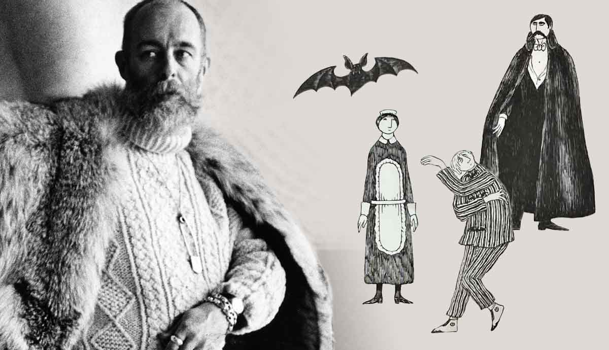
Edward Gorey was an American author, fine artist, and costume designer active in the 20th century. He illustrated his own books as well as other writers’ books. His style is quite distinctive. Gorey used pen and ink to draw characters and scenes during the Victorian and Edwardian eras. He primarily created children’s books, even though he didn’t feel emotional attachments to children in particular. Gorey also experimented with more serious concepts through his surrealist books. His work has been classified as gothic. Gorey’s illustrations are easily identifiable and recognizable to this day. Read on to learn more about Edward Gorey!
Edward Gorey’s Background

Edward Gorey was born in 1925 and his gift for drawing and interest in books was apparent at a very young age. He thrived academically, skipped several grades, and was heavily involved in school activities. While still in school, his drawings got published in Chicago newspapers. In 1939, he started exhibiting his artworks at the Francis Parker School that he attended. He was drafted in World War II and served in the army from 1943 to the end of the war. After returning, he majored in French Literature at Harvard and wholeheartedly pursued writing stories and poems, designing sets, and directing for the Poets Theater.
He began working with Doubleday’s new imprint Doubleday Anchor in New York City and became a well-known name in the NY design world. His cover designs and commercial illustrations gained him recognition and his work with the publisher houses Looking Glass Library and Bobs-Merrill allowed him to launch out as a freelancer in the early 1960s. He had started writing and illustrating his own books while drawing over five hundred illustrations for others, with his first book being The Unstrung Harp published in 1953.

His artworks were showcased at the Gotham Book Mart starting in 1967 until his death in 2000. In 1975, Gorey explored printmaking and produced limited-edition prints, etchings, and holographs. He became involved with animating introductions for a television series in 1980. He and his family moved to Cape Cod in 1983 and he continued to exhibit his art, create etchings, and balance commercial projects. Gorey’s extensive collection of work and his versatility from designing books to his work on off-Broadway productions reveal his diverse artistic abilities.
The Unstrung Harp (1953): A Semi-autobiography

The Unstrung Harp was the first book that Gorey both wrote and illustrated. His Edwardian style first emerges through his intricate drawings. The main character, Mr. Earbrass, is an author who is searching for the title of his next novel. He chooses a name randomly and proceeds to stress over the process of writing the plot. It is said to be semi-autobiographical and shows a glimpse into the mind of Gorey and his writing methods. Unlike his following books, this one is filled with mostly words, yet the drawings play a crucial role in conveying the story.

A loose crosshatched technique is used with a pen for the illustrations. The images have a comedic feel, characteristic of his style. This looser look was rare to find in his future works but his attention to detail pervaded the entirety of his portfolio. Mr. Earbrass is drawn in a disproportional form that he later shortened to create a more realistic human figure. These book illustrations freeze a moment in time when Gorey was still developing his artistic style. This is the reason why these drawings are important to examine when outlining the timeline of his creative works.
A drawing dated around 1950 is considered to be an early version of Mr. Earbrass. It was a part of his first public art exhibition at the Mandrake Book Shop near Harvard University. It shows an Edwardian man reminiscent of the main character standing in front of an early motor car. The figure’s profile is elongated, and the car is 2-D, which was a signature look of Gorey’s that’s consistent with the drawing style in The Unstrung Harp.
Dracula: A Perfect Match

Gravitating toward macabre visuals, the assignment to create book covers for Dracula was fitting for Gorey. He was already a fan of Bram Stoker’s classic, making this a perfect opportunity for him. His cover version was published in 1977. What guided him towards this dream come true was the chance he was given to design sets and costumes for a Dracula play at a Nantucket theater in the seventies. This led to a 1977 Broadway revival of the show which he designed as well. A toy theater created by him was released in 1978, which was simply a scaled-down version of the real set he created for the stage production.

His drawings of the characters for all these projects were created with thin black linework and touches of red details. The men, like Dr. John Seward, all wore fashionable suits filled in with his distinguishable cross-hatching technique. The women’s dresses, like the one worn by Mina Murray, are more delicately designed with no shading and tasteful red accessories like a scarf or rose. As to be expected, Count Dracula is colored in the darkest, with limited highlights revealing his bat-like cape.

The endpapers are a flattened version of the sets he designed for the play. For the built 3-D version, his plan involved layering stone walls, bats, figures, and other details to add complexity to each sequence. In his rendered drawings, every inch of space is filled with exactly that, making them intriguing scenes to observe. The original set drawings have been showcased in museum exhibitions and include production notes from Gorey in the brainstorming stage.
PBS Mystery!: His Drawings Brought to Life

The PBS Mystery! series was first aired in 1980 as a crime drama and Gorey created the drawings that would be animated for the opening sequence by the filmmaker Derek Lamb. Joan Wilson, the creator of PBS’s Masterpiece Theater came up with this idea. Gorey proposed the concept of using a Victorian children’s puppet theater, yet it didn’t fit the length of the script. An evolved version was produced, where more lighthearted moments were added to keep an air of mystery to the dark side of the show.

The original sequence involved a formal dance, a funeral, an investigation, a rainy game of croquet, and a recurring distressed woman. It changed over time to be more succinct and colorful. The general mood is ominous and unsettling, mostly in black and white with hints of color. His cross-hatched line work is brought to life through movement, creating drama from already startling drawings.
One clip shows the damsel in distress lying on top of a grave in a cemetery. She moans as an eye in the dark sky looks down on her. As with many of his drawings, a caption or supplementary written story isn’t needed to inspire the imagination to invent interpretations of such enigmatic scenes. And the unsatisfying feeling of the unknown when observing his work is why his artistry matched so well with the show Mystery!
Edward Gorey and Ballet

Edward Gorey was an avid audience member of the New York City Ballet, consistently attending about 30 years of dance performances. He was so familiar with ballet, that he was able to imagine the progressions of the dancers’ movements. One of his friends stated that he viewed about 160 shows a year plus all the Nutcrackers. The choreographer George Balanchine was one of his most significant muses. His signature phrase Just do the steps stuck with Gorey as he strived to create the most original work he could. The storyless dances Balanchine orchestrated inspired Gorey, and the movement and tension apparent in ballet transferred to the pages he worked on.
Doing the Steps: Edward Gorey and the Dance of Art is an art exhibition that opened this year at the Edward Gorey House, where he lived and worked for years before his passing. Many of his drawings involving ballet were exhibited as well. The works demonstrate his love for dance as well as a testament to one of his biggest influences, the choreographer himself, for his grand portfolio of art through the years. With this in mind, each of Gorey’s books can be read as a ballet piece itself.

Gorey produced one complete ballet, titled Fête diverse, ou Le bal de Madame H. It was performed in 1978 by the Eglevsky Ballet Company at Hofstra University in New York. He designed each costume, from A Dismembered Corpse to Decayed Gentlefolk. His original sketches of characters and costumes reflect his signature style with painted colors to test out the full look of the outfits. This project combined two of his favorite things: ballet and costume design.
Edward Gorey’s prolific artistic career involved a range of many mediums he experimented with. From developing interactive children’s books to establishing himself as a fashion icon, his creative expressions were limitless. The formation of his own unique illustration style is admirable. His work with ink and pen is easily identifiable by many. Gorey’s involvement with designing stage performances like Dracula and making drawings that were transformed into animations for Mystery! show his eclectic scope of talents. The dark Edwardian style Gorey drew in will always be linked to him and will continue to influence artists.


